
Demographics and Rates
Published:
Prelude
Yesterday morning, I was reading an Atlantic article over breakfast and my imagination was piqued by this line:
[P]eople over 50 account for 93 percent of COVID-related deaths in the U.S., even though they represent just 35.7 percent of the population.
I’m sure you, like me, have seen statistics of this format all over the place, whether about age demographics and COVID, racial demographics and gun violence (see stat #4 on the linked page), gender and physics PhD’s, or any number of other sobering demonstrations. But for whatever reason, upon reading this, a different question occurred to me: What’s the relationship between these population splits (fraction of deaths and fraction of population above 50) and the rates of death in the two sub-populations? That is, given that some demographic group accounts for $f_p$ fraction of the population and $f_d$ of the deaths, what’s the relationship between the death rates in the group and in the rest of the population?
Warmup
We can work this out pretty easily. Let $p_1$ and $p_2$ be the numbers of people within and outside the group, and $d_1$ and $d_2$ the number of deaths within each of those populations. Then, by my definitions above:
\[\frac{p_1}{p_1+p_2}=f_p\text{ and }\frac{d_1}{d_1+d_2}=f_d\]Rearranging these definitions, it is also true that
\[(1-f_p)p_1=f_pp_2\text{ and } (1-f_d)d_1=f_dd_2\]So by dividing these equations by each other and doing one more rearrangement, we find that
\[\frac{d_1}{p_1} = \frac{(1-f_p)f_d}{(1-f_d)f_p}\frac{d_2}{p_2}\]which is the answer to the original question. So for the numbers given in the article, $f_d=0.93$ and $f_p=0.357$, so the ratio of death rates of people over 50 and under 50 is
\[\frac{(1-0.357)\times 0.93}{(1-0.93)\times 0.357}\approx 23.9\]That’s a pretty stunning number! (I would argue it’s actually a lot more dramatic of a way to present this information, if you really want people to feel concerned…)
Start to generalize…
But what I was curious about at this point was the behavior of this function in general. It’s clearly quite nonlinear, which, given how often these kinds of statistics show up in journalism, makes me nervous, since we know people are bad at reasoning about nonlinear relationships.
So first off, let’s get a sense of what this function looks like. I made a simple visualizer for the contour lines using the amazing Desmos online graphing calculator (along with GIFsmos for generating the GIF file). This animation swings from a ratio (i.e. the 23.9 number above) of 0.001 to 1000 in logarithmic steps:
Transform the variables!
Okay, cool, so this gives us a sense of things, but I think there’s probably a better way to grok the extent of nonlinearity relative to people’s intuition. For me, the “natural” variable to think in is the ratio of $f_d$ to $f_p$, since that’s, I think, often meant to be the “eye-catching” thing about these statistics – so in the original quote that would be that .93/.357 number, i.e. ~2.6, which ends up mapping to a rate ratio of 23.9. We can’t massage the result above into one that only depends on that ratio, so let’s try the next-best thing and just take a fixed value of $f_p$, sweep $f_d$ and plot as a function of the ratio. To be explicit about what I mean, let $r\equiv f_d/f_p$, then the expression above for the death rate ratio can be written as:
\[\frac{d_1/p_1}{d_2/p_2}=\frac{(1-f_p)f_d}{(1-f_d)f_p}=\frac{\frac{1}{f_p}-1}{\frac{1}{f_p}-r}r=\frac{1-f_p}{\frac 1 r - f_p}\]Here’s an animation of this family of curves with $f_p$ animating linearly from 0 to 1. Note that they have singularities at $r=1/f_p$, and that the curve is basically linear when $f_p\ll1$ (because that’s where you can’t make $r$ any bigger since more than the entire population would be dying):
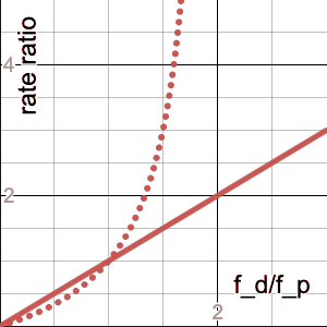
The dotted line is the curve for $f_p=0.5$, which is an interesting reference because it’s approximately where you start to see the $r<1$ portion of the curve noticeably bending as $f_p$ continues to increase, whereas the $r>1$ portion slows down its “whipping” motion. And this makes sense, because that’s the crossover point of our “focus demographic” becoming the majority of the population, so the $f_d<f_p$ portion (i.e. $r<1$) would have more “leverage,” so to speak.
The $f_p=0.5$ case is worth staring at for awhile also because it’s a good reference for any gender-related statistics, as this curve can be seen as a quantification of the over- ($r>1$) or underrepresentation ($r<1$) of one of the (traditional binary, insert requisite grumbling about the people who typically collect these data) genders. For example, in the statistic “In 2017, women earned 20% of physics doctorates,” if we assume women are 50% of the population, then $f_p=0.5$ and $f_d=0.2$ (where, in a somewhat unfortunate set of analogies, “dying of COVID” transmutes into “getting a physics PhD” and “being over 50” transmutes into “being a woman”), then $r=0.4$ and so the ratio of rates of PhD attainment among women vs. men is 1/4.
Some concluding remarks
It may seem that there’s an implicit critique here of ever presenting statistics of the form I’m exploring in this article. And while I do think that rates within the demographics of interest are probably less misleading overall, of course it is also relevant what fraction of the population a demographic represents, both to get a sense of the overall scale of an effect, as well as to guard against statistics that could just be sampling error (I would be less concerned if you told me the “raw” rate of COVID fatality in some population were 95% if it turned out there were only 20 of them total to start with).
I do think that being able to think carefully about these kinds of statistics, in whatever form they’re presented, is valuable, though, as well as being a fun mathematical exercise. In any nonlinear function, someone trying to push a narrative can easily take advantage of that nonlinearity to make an issue seem more or less dramatic/urgent by choosing the set of variables that is most convenient for them – as a quick example of this, let’s rejigger the numbers slightly from the original example and imagine a hypothetical demographic making up 30% of the population but 40% of the deaths. This by itself might not seem so alarming, but if we run the numbers, we see that in fact that members of this group have a 56% higher death rate than the rest of the population – may not be 24x, but it would still be concerning!
Anyway, that’s all for now – hope the rate of fun-having in the population of readers of this post is at least half of what it was for the writer!